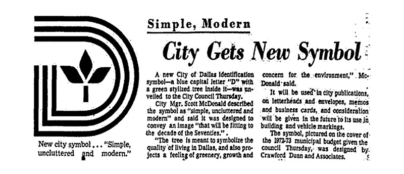
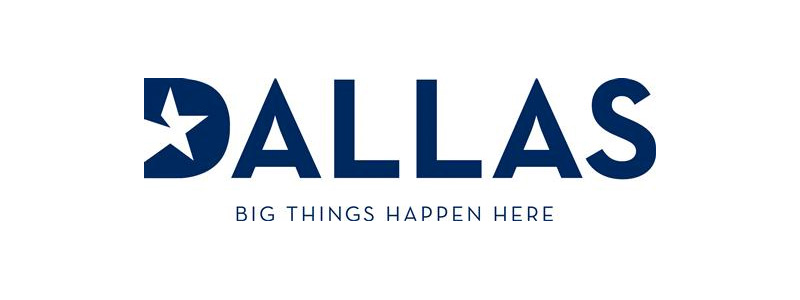
In Dallas, the local news outlets are all abuzz with a recent proposal to change the city’s official logo (the renowned Triple D, which was designed in 1972) to a logo currently being used by the Dallas Convention & Visitors Bureau. Naturally, there are passionate champions on both sides of the issue. In the current logo’s corner we find preservationists, traditionalists, and rationalists who either remain emotionally attached to the current logo for personal reasons or who simply believe that the inevitable aftermath of adopting a new logo is a waste of public funds. However, those who support the idea of a “new” logo decry the supposedly dated look of the current mark, and declare that the city needs an “identifiable brand”.

This conversation raises some interesting questions. First of all, can a city have a designed “brand?” If so, what is the city of Dallas’ brand? Who is the city’s brand targeting? Finally, how does the city’s logo fit into that?
It must be noted first of all that branding and logo design aren't the same thing. Logo design is a part of the branding process, and in most cases should be one of the last elements that is developed. It is the culmination of an idea. The cherry on the top of the sundae. An iconic stamp of approval at the end of a thorough exploration of an organization’s character.
Branding, however ubiquitous and watered-down that term has become in the public forum, is at its core the exploration of that character. “Branding” is an active verb. It is a process. A “brand” is not something you create from nothing, it is something that already exists in one state or another that designers can help define for a wider audience. It can be poked and prodded and molded into something specific to meet certain goals, of course, but in order for a pot to be fired and glazed it first has be be crafted from raw materials. Most often in my own design practice, those raw materials come in the form of a person or a few people who have values, strengths and goals that can be made into something tangible. That’s a brand.
The question then becomes, is it possible to truly “brand” a city? The population of Dallas is around 1,200,000. While the city might have an inherent brand, it’s so complex and constantly roiling that untangling this eternal knot would be a pretty herculean task. Perhaps the brand exists, but is it attainable?
Now, let's talk about this thing for a minute:

Admittedly, from a critique standpoint, the logo (perhaps unfairly extracted from the context of its original campaign, though that does fit with the proposal) is low-hanging fruit. Toss a Reunion Tower silhouette in there and you have an all-star lineup of overused and ultimately shallow visual tropes. The logo says nothing about the character of the city, and is merely an echo of the patterns we've been seeing since a certain pro football team came onto the scene a few decades ago.
Like I said, low hanging fruit. But that’s not the point.
In other news, I already have an outline written of my thoughts on the Dallas logo question and the branding of cities. Words coming soon.
— Justin Childress (@justinc) August 20, 2015
Spoiler: Syed is probably asking the right questions, but so far she's looking for answers in the wrong places…specifically the DCVB. — Justin Childress (@justinc) August 20, 2015
Spoiler 2: The city DOES have an identifiable brand, the question is if it is "marketable" or "cool". pic.twitter.com/lIrtH4W50A
— Justin Childress (@justinc) August 20, 2015
Spoiler 3: This is an advertising campaign, not a brand. pic.twitter.com/ZCPyijteBP — Justin Childress (@justinc) August 20, 2015
The point (as I tweeted in reply to Wilonsky’s joke-y and yet oh-so-painful “design contest” suggestion) is that the Big Things Happen Here campaign is not the city’s brand. It is too broad and undefined. It is focused outward, not inward toward the population as a city’s brand probably should be. Because of this fact it isn’t even an appropriate replacement for our current municipal branding, as noted by my good friend Robbie.
The only brand @1500Marilla has is their services. An official seal/stamp is all they really need (& the triple D serves them well)
— Robbie Good (@robbiegood) August 21, 2015
As Ellen Lupton (via Mark Lamster) reinforced herself later that week, Big Things Happen Here is an advertising campaign. It was created to promote a very specific entity, the DCVB. It is aspirational. It is inherently promotional. That’s fine, as long as you understand that its fundamental purpose is to attract corporate entities looking for a place to hold a conference. When viewed in that context, the "big things" that happen here could literally be "big conferences," so all of a sudden the campaign starts to make more sense.
But if the question is “how do we brand the city,” we need to start with “who is the city?” Who is the brand representing? Who are we? What are our values, strengths and goals? How do we communicate those honestly? The process of exploring that question should be daunting. It should be hard. It should take time and energy and involve a lot of people. If the city wants to engage in that process, they should engage in it fully instead of co-opting an advertising slogan from a tourism entity. If we want to create another advertising campaign for the city then that’s fine, but it’s a different conversation altogether.
This brings me back to our old friend the Triple D. While the technical issues are obvious (poor balance, weird counterform spacing, etc. etc.) the fact that it has simply been there during a complicated time in the city’s history might be worth something. Maybe the fact that every citizen of the city since 1972 has encountered the symbol has allowed it to absorb some of the individual character of those people who make up the hopes, dreams and even failures of Dallas itself.
Maybe that’s enough.
I don’t know, perhaps that’s too romantic. I know it’s just a logo, a bunch of lines put together to make a rough little picture. But the fact that so many people feel like that little picture is embedded in their own stories mean that if we want to consider replacing it, we need approach the issue with the gravity it deserves.
Maybe for now, though we should fix some potholes or fund our libraries instead.
........
(I also couldn't resist taking some time to give our Triple D a little TLC*. Consider this freebie a token of my enduring and sometimes confusing affection for you, Dallas.)

